What the Curtain Hides: Why Your Logo Should Invite a Second Look
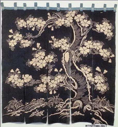
Photo: Unknown, CC0, via Wikimedia Commons
Walk down almost any street in Kyoto's older neighborhoods and you'll pass shops whose names you cannot read. A short indigo curtain — a noren — hangs across the entrance, brush-lettered with the shop's mark, and then you're through it, into a space you half-guessed before you entered. The curtain does not explain. It conceals the interior, dims the light, narrows the view. And yet no one in Kyoto struggles to find the good soba shop.
American founders tend to find this arrangement mildly maddening. We've been trained to believe that clarity is a virtue measured in seconds: if a customer can't understand who you are, what you do, and why it matters within three seconds of landing on your homepage, you've failed. The noren seems to violate every rule in the playbook. It obscures rather than reveals. It slows the customer down at the precise moment marketers are told to accelerate them.
And still, it works. Which raises an uncomfortable question for anyone commissioning a logo this year: what if the demand for instant comprehension is producing brands that are comprehended once and then forgotten?
The Economics of the Second Glance
There is a distinction worth making between attention that is demanded and attention that is rewarded. A logo that shouts — bold sans-serif, saturated color, a tagline bolted underneath explaining everything — can seize the first glance. But it has spent all its energy on arrival. There is nothing left to discover. The second look returns exactly what the first look did.
A noren works differently. Its lettering is often partially hidden by the drape, the fabric, the angle of approach. You assemble the shop's identity from fragments: a brushstroke, a smell of dashi, the sound of voices behind cloth. The brand is completed by the customer, not delivered to them. Psychologists would call this the generation effect — information you partially construct yourself is retained more deeply than information handed to you whole. Marketers would call it intrigue. Either way, the mechanism is the same: incompleteness is not a flaw in the identity. It is the engine of it.
Consider the American brands that command genuine devotion — not awareness, devotion. Very few of them explain themselves. Their marks are often stubbornly ambiguous, their advertising elliptical. They've absorbed, whether deliberately or not, the noren's lesson: a logo that rewards attention builds a different relationship with an audience than one that demands it. The first creates insiders. The second creates passersby.
The Second Look Test: A Practical Audit
For founders evaluating an identity — new or existing — here is a four-part audit we use in our own studio work. It takes an afternoon and a bit of honesty.
1. The Squint Test, Inverted. The classic advice is to squint until your logo is a blur and check if it's still recognizable. Fine. Now do the opposite: stare at it for a full minute and ask what you notice on the fortieth second that you missed on the fourth. If the answer is nothing — if the mark is entirely legible at first contact — you may have a sign, not a symbol. Signs direct. Symbols reward revisiting.
2. The Fragment Test. Crop your logo into quarters and show each fragment to someone unfamiliar with your brand. Can they sense a system behind it — a logic of form, weight, or color that suggests the whole? Kyoto's shop curtains work because every element, even a partial one, carries the hand of the same maker. Fragmentary coherence signals craft. Fragmentary incoherence signals stock.
3. The Explanation Test. Write down everything your logo needs to communicate, then delete the items a tagline, a headline, or a single homepage sentence could carry instead. What remains is the logo's true job — and it is almost always smaller, stranger, and more durable than the brief originally claimed. A noren does not list the menu. It marks the threshold.
4. The Return Test. Show the identity to the same person twice, a week apart, with no commentary. Ask what changed. Nothing has changed, of course — but what they notice will have. Identities built for the second look reveal detail on return: a ligature, a texture, a quiet joke in the negative space. If your mark gives nothing on the second encounter, it was designed for a first encounter that will never come again.
Concealment as Confidence
There is a temperament underneath all of this, and it is the temperament we associate with Kyoto's longest-lived workshops: the confidence to be partially known. A shop that hangs a noren across its door is declaring that what's inside can bear the weight of curiosity. It does not need to be legible from across the street because its reputation does that work.
Most American brands are built the other way around — fully exposed, endlessly explained, optimized for the glance of a stranger who will never return. There is safety in that, and for some businesses, it is the right call. But brands that want tenure rather than traffic might consider the curtain. Leave something unsaid. Let the mark withhold a little. Trust the customer to lean in.
The best identity work we do rarely ends with a client saying the logo is clearer. More often, they say people keep looking at it. That is not a failure of communication. That is the curtain doing exactly what curtains have done in Kyoto for four hundred years — not hiding the shop, but honoring it enough to make you want to see what's behind.