Layout as Welcome: How Kyoto's Temple Gardens Quietly Shape Where You Walk
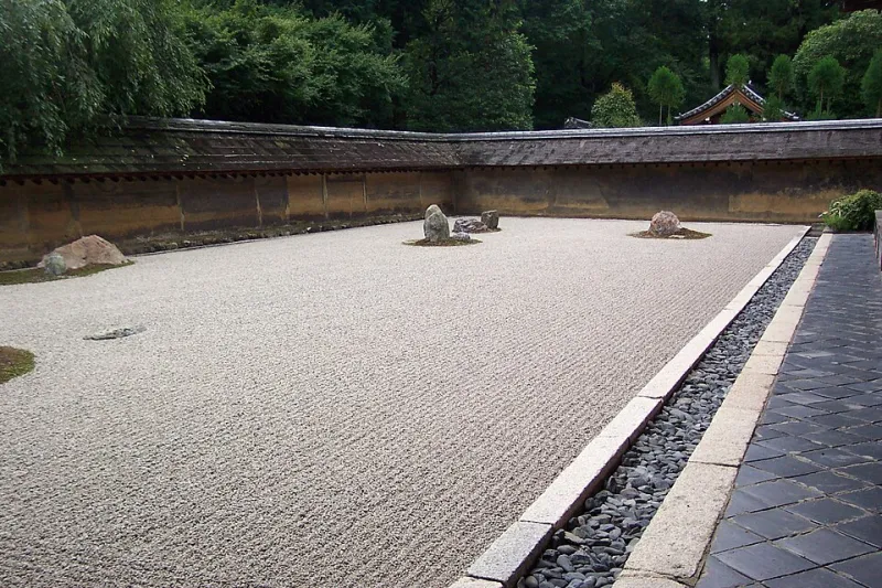
Photo: BMR & MAM, CC BY-SA 2.0, via Wikimedia Commons
Stand at the entrance of Ryoan-ji and you will notice something strange. There is no fence directing you, no rope funneling you toward the famous rock garden. And yet every visitor, without exception, arrives at the same wooden veranda, sits, and looks at exactly what the designers intended them to see — five centuries after they laid the stones.
Nothing commands. Everything suggests. This, we would argue, is the highest ambition of layout — on gravel or on a homepage.
The Garden That Designs Your Path
Kyoto's temple gardens are compositions disguised as landscapes. The designer of a stroll garden like those at Shugakuin or Tenryu-ji does not build a road; they build a sequence of temptations. A stone lantern peeks through maple branches around one bend. A pond opens up precisely where the path widens. You believe you are wandering. You are, in fact, being choreographed.
The technical vocabulary here is worth borrowing. Shakkei, or borrowed scenery, frames a distant mountain so it appears to belong to the garden — the designer claims no credit, but the framing was entirely deliberate. Stepping stones (tobi-ishi) force a slower pace and a lowered gaze, pulling attention to the immediate. Raked gravel creates texture that reads as calm from a distance and as craft up close.
Now hold that vocabulary up against the average American SaaS homepage: a hero banner shouting three competing value propositions, a sticky navigation bar, three exit-intent popups, and a chat widget that greets you before you've read a word. Nothing here is borrowed scenery. Everything is a billboard.
Whitespace Is Not Empty — It Is the Gravel
American design education tends to treat whitespace as what remains after the real content is placed. Kyoto treats it the other way around. In a Zen garden, the gravel is not the gap between features; the gravel is the garden, and the stones are the interruptions.
Translated to the screen: your margins, your generous line-height, the pause between sections — these are not leftovers. They are the medium through which your content acquires meaning. A pricing page where every tier is boxed, badged, and highlighted in a different color gives the visitor nowhere to rest their eyes, and a tired eye does not convert. A pricing page with one clearly favored tier, surrounded by deliberate emptiness, lets the visitor arrive at the conclusion as if it were their own.
That last phrase matters. The garden's genius is that it never lets you feel steered. Behavioral research in the US has echoed this for years — choice architectures that feel invisible outperform those that feel manipulative. The garden simply got there first, and with better manners.
Three Practical Translations for the Web
1. Design the descent, not the destination. Stroll gardens are built around sequence: you cannot see the second view from the first. On a landing page, this means each scroll should reveal one new idea, earned by the one before it — not a wall of features competing for attention above the fold.
2. Place your stones where feet already want to go. Good gardeners observe desire lines before setting stepping stones. Watch your analytics heatmaps: users are already walking a path through your site. Your job is not to reroute them with a clever mega-menu. It is to pave the route they've chosen, beautifully.
3. Frame the mountain; don't build one. Borrowed scenery means letting external things — a testimonial, a press logo, a single striking photograph — do the persuading, positioned so they seem to belong naturally to your composition. A page that vouches for itself is less believable than one that arranges credible witnesses at the right distance.
The Conversion Path as a Garden Walk
There is a temptation, especially in the US market, to treat conversion as capture: fence the visitor in, remove exits, add urgency. The garden offers a counter-model. A visitor leaves Ryoan-ji when they are ready, through a gate that opens easily — and many of them buy the tea, the book, the print on the way out. The garden trusted them enough to let them go, and the trust itself became the product.
A conversion path designed this way looks different. It offers a clear single next step at every moment, but never blocks the door. It respects the visitor who came only to look, because that visitor is forming an impression that outlasts the session. It measures success not just in today's click-through rate but in whether the person who left without buying remembers the visit with warmth.
Quiet Is a Strategy
None of this is minimalism for its own sake. A garden layout is rigorous — every stone weighed, every sightline tested across seasons. The effortlessness is the point, and it is expensive. The same is true of a well-ordered webpage: the restraint you see rests on an enormous amount of decided-against.
The next time you open a design file, ask the gardener's question: where do I want this person to sit down, and what do I want them to see when they do? Then remove everything that isn't helping them get there.
The best layout, like the best garden, is the one the visitor never notices — they simply find themselves exactly where they hoped to be, wondering how they arrived so naturally.