Seven Digital Manners Your Website Is Forgetting

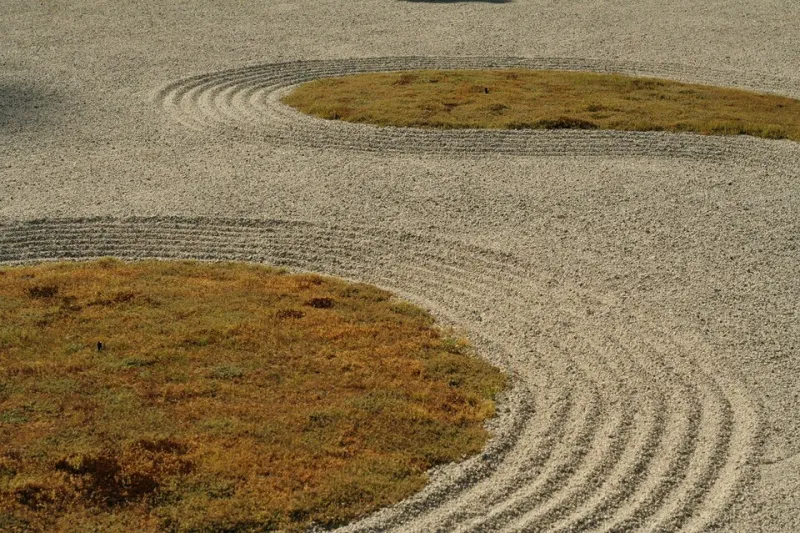
Photo: Dietmar Rabich, CC BY-SA 4.0, via Wikimedia Commons
Spend a morning in a Kyoto craft workshop and you will notice how much of the practice is organized around the guest. The tea is prepared before you arrive. The tools are arranged the night before. Nothing is presented until it is ready to be received. The governing assumption is that the visitor's attention is a gift, and the host's job is to deserve it.
Hold that assumption against the average American website, and the contrast is bracing. The modern web has developed a set of habits that treat every visitor as a resource to be extracted — attention mined, clicks harvested, hesitation punished. Designers did not set out to be rude. But the patterns compound, and the cumulative message to the user is unmistakable: we do not trust you to choose.
Below are seven habits we believe any trained craftsman would find genuinely alarming, each paired with a more hospitable alternative.
1. The Countdown Timer That Lies
The sale ends at midnight. It also ended at midnight yesterday, and will end at midnight tomorrow, because the timer resets for every visitor who clears a cookie. A craftsman would call this a straightforward falsehood delivered in wood and lacquer — the digital equivalent of a shopkeeper swearing the price doubles at dawn.
Instead: If an offer genuinely expires, let it expire, visibly and permanently. Scarcity that is real does not need a flashing red clock.
2. The Exit-Intent Pop-Up
The visitor has read your page and decided to leave. In that moment of quiet judgment, the site lunges: a modal blocking the door, offering 10% off. It is the retail equivalent of grabbing a guest's coat as they reach for it.
Instead: Earn the return visit. A site worth remembering gets revisited. If you must capture interest, a single unobtrusive invitation — placed where the reader finishes, not where they flee — respects the decision you are asking them to make.
3. The Infinite Cookie Banner
Nothing says "we value your time" like forcing a visitor to negotiate a legal document before reading a single sentence. Cookie walls that make rejection take four clicks while acceptance takes one are not consent; they are friction dressed as compliance.
Instead: Design the decline path to be as fast as the accept path. Better yet, minimize tracking so the conversation is shorter. A workshop that collected fewer shavings would need a smaller broom.
4. The Newsletter Modal Before the First Impression
A first-time visitor has seen your homepage for six seconds. You have shown them nothing yet, and already you are asking for their email. This is a host requesting a favor before offering a seat.
Instead: Give first. Let the visitor encounter your work, your thinking, your craft. The subscription ask belongs at the end of a genuine exchange — after an article read, a portfolio browsed — when it reads as an invitation rather than a toll.
5. The Fake Chat Agent
"Hi there! 👋 I'm Ashley! How can I help?" — sent, in many cases, by a bot with no ability to help, deployed to simulate human warmth it does not possess. A craftsman who signed another maker's name to his work would be dismissed from the guild.
Instead: Label the automation honestly. "I'm a helper bot — for a person, email us at…" converts fewer impressions and retains far more trust. Honesty scales; simulated intimacy does not.
6. The Sticky Bar That Never Leaves
Promotional banners that pin themselves to the viewport and follow the reader through every scroll treat the page as a billboard rather than a room. The content becomes a backdrop for the sell.
Instead: Let promotions live where promotions belong — the top of the page, the end of the article, the footer. A room with one well-placed object reads as considered. A room where every surface shouts reads as a clearance aisle.
7. The Interface That Punishes Slowness
Auto-playing carousels, hover states that vanish in half a second, forms that time out — these designs assume the visitor's pace is a problem to be corrected. Craft tradition assumes the opposite: the guest sets the tempo.
Instead: Build for the deliberate reader. Give carousels manual controls. Give tooltips patience. Generous time limits and stable layouts are the digital form of a bench placed where the view is best — an acknowledgment that some visitors want to stay a while.
Patience as a Design Material
There is a thread running through all seven: each offending pattern optimizes for the next click at the expense of the relationship. Each treats hesitation as failure rather than consideration.
Craftsmen in Kyoto speak of patience not as passivity but as a material — something you work with, deliberately, the way one works with wood grain rather than against it. Applied to the web, patience looks like pages that load without ambush, offers that tell the truth, and interfaces that wait for the visitor rather than chasing them.
The commercial argument is straightforward: the patterns above convert marginally in the short term and corrode trust in every quarter after. The brands American audiences return to — the ones they recommend at dinner parties — are overwhelmingly the ones that let them think at their own speed.
Design your site as though the visitor were a guest in your workshop. It is, after all, the only hospitality that ever worked.