The Silence Between Elements: How 'Ma' Rewrites the Rules of American Visual Design
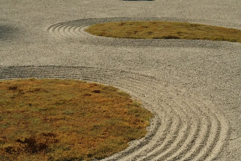
Photo: Heather from Seattle, WA, CC BY 2.0, via Wikimedia Commons
Walk through the Ryoan-ji rock garden on a weekday morning and you will notice something American audiences rarely encounter in a brand experience: nothing happening. Fifteen stones, raked gravel, a wooden veranda. The composition works precisely because most of it is empty. What is not there carries the meaning.
In Japanese, this intentional interval is called ma — a character that means both space and time, gap and pause. It is not negative space in the Western sense, where emptiness is defined by what surrounds it. Ma is a positive material, shaped as carefully as type or clay. For a studio like ours, raised among Kyoto's craft traditions, it is the single most transferable idea we bring to American branding work. And it remains the most undervalued.
The American Aversion to Emptiness
American commercial culture grew up on the frontier logic that more is proof of effort. The dense newspaper broadsheet, the full-page department store circular, the website with a chat widget, exit intent popup, six CTAs, and a hero carousel — each generation inherits the anxiety that a viewer left unattended might leave unconverted.
The results are measurable. Heatmaps of typical e-commerce pages show attention collapsing under visual load; studies from the Nielsen Norman Group have long shown that white space improves comprehension and reading speed. Yet the instinct to fill persists, because emptiness reads as risk. A page with room to breathe looks, to some stakeholders, like work not yet done.
What the Craft Traditions Understand
Consider the logic of a Kyoto tea bowl. A chawan shaped by a master potter is not decorated to exhaustion; its glaze may break unevenly, its rim may waver slightly, and that irregularity — informed by wabi-sabi — invites the viewer's imagination to complete the object. The craftsperson leaves room deliberately. Restraint is not minimalism for its own sake; it is confidence that the audience will meet you halfway.
The same principle governs traditional joinery, where a carpenter might leave a suri-awase gap for the wood itself to move, and indigo dyeing, where the undyed cloth is part of the pattern. In each case, the maker trusts the material, the moment, and the viewer.
Silicon Valley rediscovers the pause
To be fair, American design has had its conversions. Apple's ascent normalized generous white space in tech marketing to the point where it is now a cliché of its own. More recently, a wave of brand refreshes — from fintech apps to DTC packaging — have stripped back gradients, drop shadows, and copy density in favor of air. Some of it is genuinely ma. Much of it is emptiness wearing restraint as a costume, with no rhythm underneath.
The distinction matters. Emptiness without intention is just a blank page. Ma is structured: the pause has a duration, the gap has a shape. A homepage hero with a single line of copy and one action works because everything competing for attention has been consciously removed, not merely deleted at the last revision.
Practical disciplines for the restraint-minded designer
If you want emptiness to read as confidence rather than absence, treat it like any other material:
- Set the interval before the content. Decide margins, line length, and section breaks first. In Kyoto workshops, the frame is prepared before the object. In layout, the grid is your joinery.
- Give every gap a job. A pause between sections should create anticipation or signal a change in register. If the space does nothing, it is filler in reverse.
- Edit in the third pass, not the first. Draft generously, then remove. What survives removal has earned its place; what you simply failed to add teaches you nothing.
- Test silence with real users. Watch where visitors hesitate in a good way — reading, absorbing — versus hesitating in confusion. Ma should slow attention, not stop it.
- Defend the void in the room. The pressure to fill space rarely comes from designers. Prepare language for stakeholders: the empty area is where the customer thinks, and thinking precedes trust.
Trust as a Byproduct of Restraint
There is a reason American consumers increasingly respond to brands that under-communicate. In a feed of shouting, the quiet voice is the one that sounds certain of itself. A packaging face with one word and a texture suggests the maker had nothing to hide. A website with room to scroll suggests the story is worth the reader's time.
At our studio in Kyoto, we have watched clients arrive asking for more — more messages, more features, more proof — and leave with less, and perform better for it. The pause is not the absence of persuasion. It is persuasion given space to land. That is the quiet argument of ma, and American branding is only beginning to hear it.