Repair Before You Replace: A Case for the Gold-Seamed Rebrand
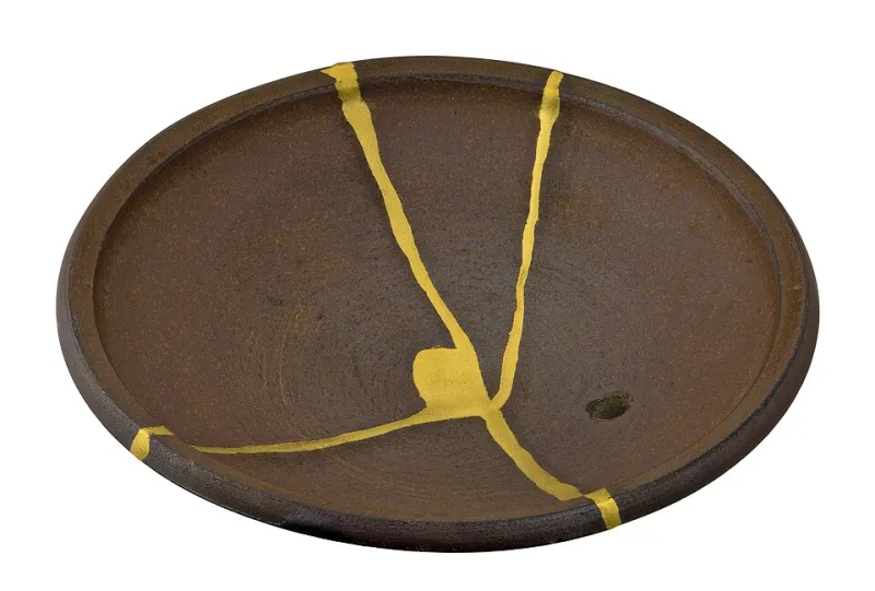
Photo: D-Kuru, CC BY-SA 4.0, via Wikimedia Commons
There is a particular kind of meeting we have sat in many times, on both coasts of the United States. A founder slides a deck across the table and announces that the company is 'due for a rebrand.' What follows is usually a budget conversation, then a timeline, then a quiet assumption that everything currently on the books — the wordmark, the packaging, the tone of the website — will be replaced wholesale.
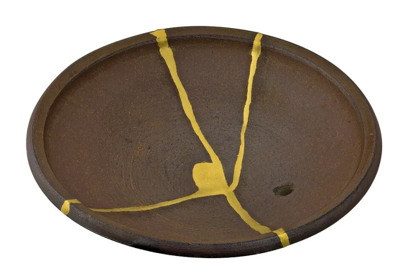
In Kyoto, where we work, there is another instinct. It is the instinct of kintsugi: when a bowl breaks, you do not throw it away. You repair it with lacquer dusted in gold, and the fracture becomes the most valuable part of the object. The repaired bowl is not a lesser version of the original. It is a more honest one.
American brand strategy could use more of this instinct. The complete overhaul is expensive, disorienting, and — critically — it discards the very equity that took years to build. What we call the gold-seamed approach asks a harder question: what if the most trustworthy thing your brand can do is show, deliberately, what it has repaired?
Why the Blank Slate Fails the Trust Test
Consider what a customer actually sees during a full rebrand. They see a familiar face return from a weekend having changed everything about itself, and they are asked to pretend nothing happened. Recognition erodes. The mental shortcut a shopper used at the shelf — that particular shade, that particular curve of a letter — is gone, and with it goes the frictionless trust it carried.
The brands that endure tend to be the ones that evolve in public. Coca-Cola has spent a century adjusting rather than erasing. The New York Times has modernized its masthead so gradually that most readers could not date any single change. When Tropicana replaced its packaging in 2009 with a sleeker design, customers revolted — not because the new design was ugly, but because the shelf shortcut vanished overnight. Sales fell an estimated twenty percent in weeks. The design was not the problem. The rupture was.
A kintsugi-minded rebrand inverts the process. It begins by asking what is broken and worth showing, not what is old and worth hiding.
The Gold-Seam Audit: A Four-Question Framework
Before commissioning anything, audit your existing brand assets against four questions. Score each asset — wordmark, palette, packaging, voice, photography — and sort it into one of two columns: gold seam (repair and elevate) or full replacement (retire with dignity).
1. Does it carry recognition, or only habit? Recognition means a customer could identify you from a fragment — a color, a corner of the label, a cadence of speech. Habit means they simply stopped noticing. Assets with true recognition earn a gold seam: keep the core, refine the execution around it.
2. Does it reflect a story you are proud to tell? A logo drawn in a founder's garage, a package design from the company's scrappiest year — imperfections that trace real history are candidates for gold. Assets that reflect an era you would rather not explain at a dinner party belong in the replacement column.
3. Would a repair be visible, and is that visibility an asset? Some repairs should be seen. A heritage manufacturer that keeps its 1950s wordmark but modernizes its typography around it is making a visible, confident repair. Others should be quiet: an accessibility fix to a color palette improves without announcing itself.
4. What does the seam cost versus what does it save? Full replacement carries hidden costs — re-shooting photography, reprinting packaging, rebuilding recognition from zero. A repair typically costs a fraction and preserves the accumulated asset. Run the honest math, including the equity column, which most agencies leave off the spreadsheet.
Brands That Repaired Rather Than Rebuffed
The pattern shows up across the American market for those willing to look. When Airbnb evolved its identity in 2014, it did not discard its name or its community; it introduced a symbol designed to sit alongside what people already knew. When Patagonia refreshes its catalogs, the photography and voice remain unmistakably Patagonia — the repairs happen in production ethics and material details, seams of a different kind. And when Mailchimp modernized its illustration system, the wordmark and the oddball wit stayed intact; the gold was added around them.
Contrast this with the graveyard of rebrands walked back within a year — often because leadership mistook boredom inside the building for rejection in the market. Executives see the logo every day. Customers see it once a month. The urge to replace is usually an internal itch, not an external signal.
The Discipline of Showing Your Work
There is a final, less commercial argument. In an era when consumers are fluent in detecting polish, visible repair reads as character. A brand that says 'we listened, we changed this, and we kept that because it matters to us' is behaving like a person, not a platform. Trust is not built by flawlessness. It is built by the honest documentation of what broke and what was done about it.
So before you write the check for a total overhaul, spread your brand assets on the table like a broken bowl. Look closely. Some pieces are beyond saving — retire them. But others have earned their fractures. Fill those seams with gold.