Beyond the Default Blue: What a Kyoto Dye Master Understands About Premium Color
Photo: MIKI Yoshihito from Sapporo City,Hokkaido., JAPAN, CC BY 2.0, via Wikimedia Commons
Open a dozen startup websites in a row and you will encounter the same atmosphere: white space, a blue somewhere between #2563EB and #3B82F6, and a gradient that fades into lavender. It is competent. It is inoffensive. It is also, increasingly, invisible — the visual equivalent of a lobby with piped-in jazz.
In the dye workshops of northern Kyoto, color is approached from the opposite direction. A master dyer works with a small vocabulary of pigments drawn from plants, each with a personality: indigo that deepens with every dip, persimmon tannin that darkens slowly in sunlight, moss tones that shift with the water. Nothing is perfectly repeatable, and that is precisely the point. The slight unevenness of a hand-dyed cloth is not a defect. It is evidence that a person was here.
American founders building premium brands would do well to steal this logic. Below are five colors most brands are afraid to touch, and why each one outperforms the safe palette.
1. True Indigo (Ai)
Indigo is not navy. It is a living blue with depth — the color of denim before denim became a cliché, the color of samurai undergarments and Edo-period workwear. Where tech blue signals 'software company,' indigo signals 'this color has a history.' Use it as a primary rather than an accent, pair it with unbleached off-white, and your brand instantly stops looking like a template. It suits financial services, legal, and any founder tired of looking like everyone else's Series A deck.
2. Persimmon (Kakishibu)
Fermented persimmon juice produces a warm, tannic rust — the color of autumn light on old wood. It is nearly absent from American brand palettes because it is neither red nor orange, refusing to sit in either column. That ambiguity is its strength: persimmon reads as heritage without being rustic, warm without being casual. A single persimmon accent against a field of warm gray can carry an entire identity.
3. Muted Moss (Usumidori)
Brands reach for green when they want to say 'sustainable' and then pick a green so saturated it looks synthetic — the opposite of the message. Muted moss, grayed and quiet, says something more credible: growth that is slow and real. Pair it with stone and paper tones for wellness, agriculture, or any brand whose promise is patience.
4. Charcoal Brown (Kuri)
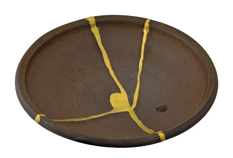
Almost no American brand dares brown, having been scarred by the corporate browns of the 1970s. But a deep, chestnut charcoal — the color of roasted grain, of walnut, of good soil — reads as grounding and expensive where black reads as severe. On packaging, a kuri-brown base with cream type feels like a product someone made rather than manufactured.
5. Barely-There Gray-Pink (Usuzumi)
Not millennial pink, not blush — a whisper of rose so desaturated it borders on gray. It is the color of cherry blossom seen at dusk rather than at noon. Used sparingly against charcoal or indigo, it adds humanity to palettes that would otherwise feel cold, and it does so without any of the cultural baggage of louder pinks.
Why Imperfection Sells Premium
The underlying principle across all five: premium perception is built on evidence of process, not on saturation. A gradient screams 'generated.' A slightly uneven, botanically derived tone whispers 'considered.' Cognitive research on luxury perception consistently finds that restraint — fewer colors, lower saturation, more negative space — is read as confidence, while loud palettes are read as effort.
A practical starting framework for founders: choose one deep anchor color (indigo, kuri), one quiet neutral (paper, stone), and at most one accent (persimmon, usuzumi). Then, critically, test your palette under warm indoor light and on recycled paper stock, not just on a calibrated monitor. Natural-dye colors are designed for the physical world, and so are the products most premium brands actually sell.
The dye masters of Kyoto will tell you that a color you cannot fully control is a color with a soul. Your brand does not need five hundred hex codes. It needs three tones that feel inevitable — and the confidence to leave the default blue behind.