What the Unmarked Door Knows: Finding the Conversion Power of a Quieter Homepage
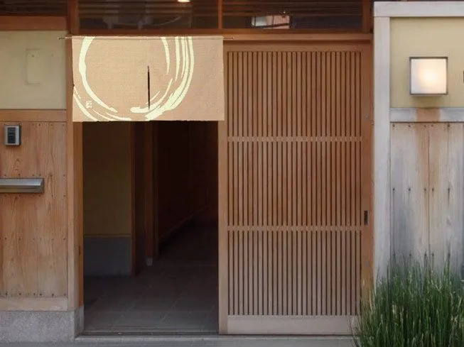
Photo: minimalist Japanese storefront entrance noren curtain Kyoto quiet street, via i.pinimg.com
There is a shop in Nishijin, Kyoto's old silk-weaving district, that I walked past three times before I found it. No signage. No window display. Just a noren curtain — a short indigo fabric panel — hanging over the entryway, and a faint smell of dye and cedar. Inside, a fifth-generation weaver sells obi silk to clients who fly in from Tokyo and, increasingly, from New York.
Nobody in that shop is worried about being discovered. The absence of noise is the discovery.
Now open a typical American homepage. A pop-up appears before the page finishes loading. A chat widget pulses in the corner. Three competing calls to action, a banner announcing a sale, a carousel cycling through messages nobody reads, and a hero headline that explains, in eleven words, what the company does — followed by a subheadline that explains it again in different words. The page is not communicating. It is pleading.
Noise Reads as Uncertainty
We tend to treat visual clutter as an aesthetic problem, a matter of taste. It is more accurately a signal problem. Every additional badge, banner, and blinking element tells the visitor something: we are not sure you'll stay, so we're going to keep trying.
Visitors are fluent in this language whether they know it or not. The Fortune 500 buyer evaluating your agency and the consumer browsing at midnight both register the same thing — a brand working too hard reads as a brand without confidence. And confidence, more than any feature list, is what premium buyers are shopping for.
Kyoto's quietest storefronts understand this at a level most conversion-rate optimization dashboards do not. The unmarked door works because it filters and flatters at once. It says: those who know, know. And the people who come through it arrive pre-sold.
Restraint Is a Strategy, Not a Style
The mistake American brands make is filing minimalism under "branding" — something you do after the real work of selling is done. But restraint functions commercially. Consider what a quieter homepage actually accomplishes:
- It speeds comprehension. One message, stated once, is understood in seconds. Five messages compete, and all of them lose.
- It elevates perceived value. Scarcity of language implies scarcity of supply. The workshop that doesn't advertise implies it doesn't need to.
- It moves attention where you want it. Remove the pop-up and the chat bubble, and the visitor's eye finally lands on your one honest call to action.
- It builds trust. A page that doesn't shout is a page that expects to be believed.
None of this is decoration. It is funnel design, executed by subtraction.
The Quiet Audit: Eight Questions for Your Homepage
Before you add anything to your homepage this quarter, walk it through a listening tour. Ask:
- How many messages appear above the fold? If the answer is more than one, you have none.
- Does anything move that doesn't need to? Carousels, auto-playing video, pulsing buttons. Motion should mean something, not merely occupy.
- Is your headline explaining or inviting? Explanation belongs on an inner page. The homepage's first job is to make someone lean in.
- Would this pop-up exist if you trusted your product?
- Can a stranger tell, in five seconds, who this is for? Not everything you do — just who it's for. If not, cut words until they can.
- How many times do you ask for the sale? Three CTAs do not triple conversion; they dilute each one.
- What is the single element a confident competitor would delete first? Delete it.
- If your best customer landed here, would they recognize why they chose you — or a sales pitch they've already outgrown?
Run this audit honestly and most teams find they can remove a third of their homepage without losing a single function. What they gain is harder to measure in a dashboard and impossible to fake: the look of a company that expects to be taken seriously.
Say Less, Mean More
There is a phrase in Japanese craft culture — yohaku, the intentional blank. In calligraphy and ink painting, the empty space is not what's left over; it is part of the composition, often the part that carries the most weight. The painter trusts the viewer to complete the work.
Your homepage can do the same. Leave the space. State one true thing about your business and let it stand. Trust the visitor to come closer — the way I finally did, past the unmarked door, into a shop that had never once needed to raise its voice.